Note: this post originally appeared in my newsletter, but I was so excited about it that I decided to post it here too. Enjoy!
So my wife is getting a PhD in computer science, which means that she’s on the cutting edge of research into things like language learning and topic models and other techy stuff that I don’t totally understand.
A couple of weeks ago, she downloaded Stable Diffusion, an open source text-to-image program that creates AI art, kind of like Dall-E and Midjourney. Besides playing with it herself, she thought it might be useful for me to create my own cover art. So for the last two or three days, I’ve been playing around with it, and the results are absolutely amazing!
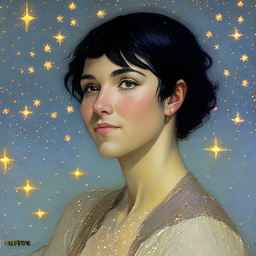
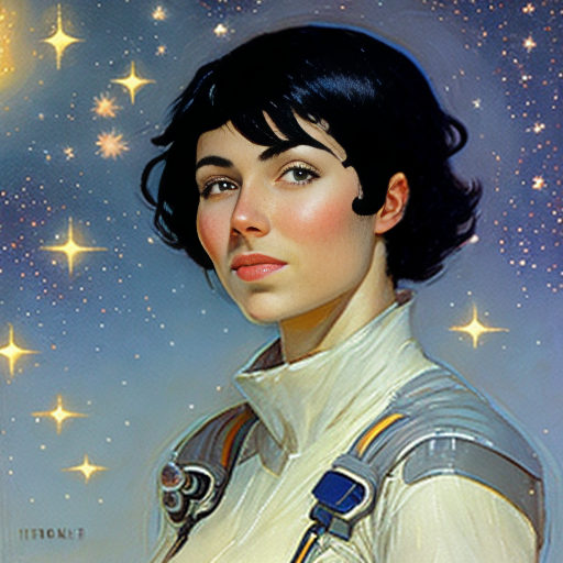
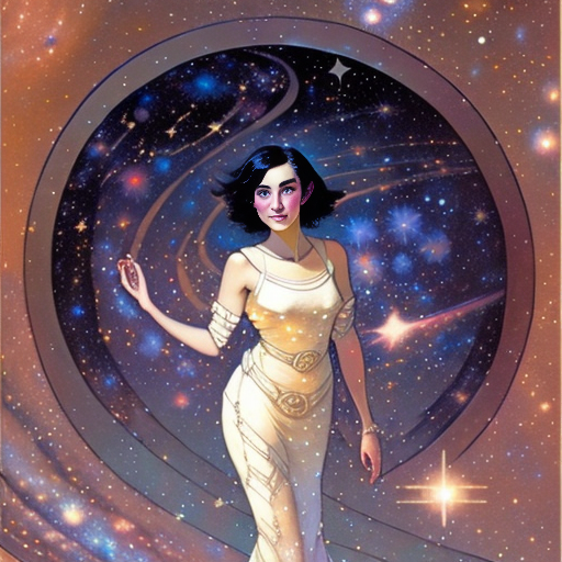
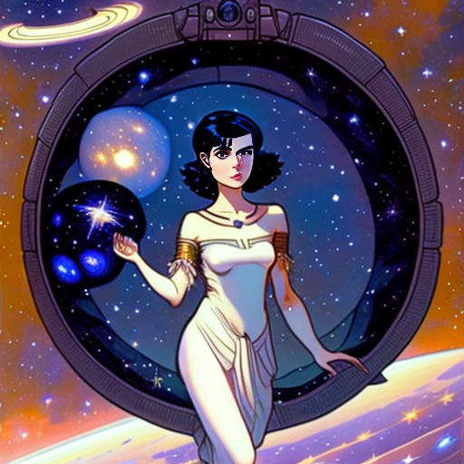
These were some of my first attempts. I’ve forgotten what the prompt was: I think it was something like “a spunky young woman with short black hair, surrounded by stars, in the style of Frank Frazetta and Minerva Teichert.” The difference between the first one and the second one was adding “in space.”
I also tried inputting a couple of paragraphs straight from my novel, including a lengthy description of this character, but the results were… uncanny. These AI art programs tend to do better if you give them short descriptions with only a handful of details.
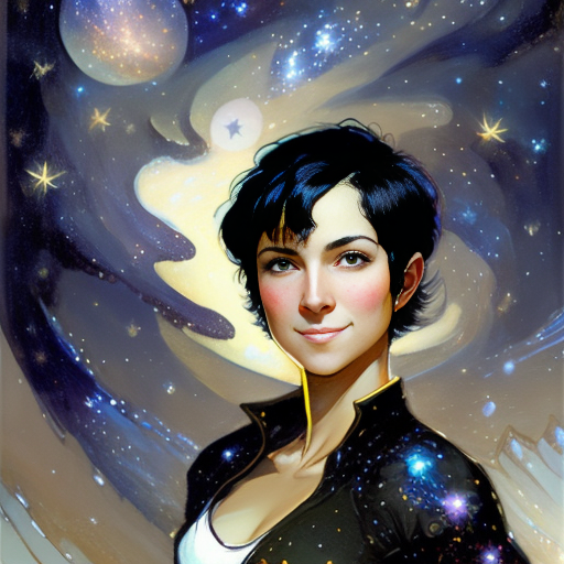
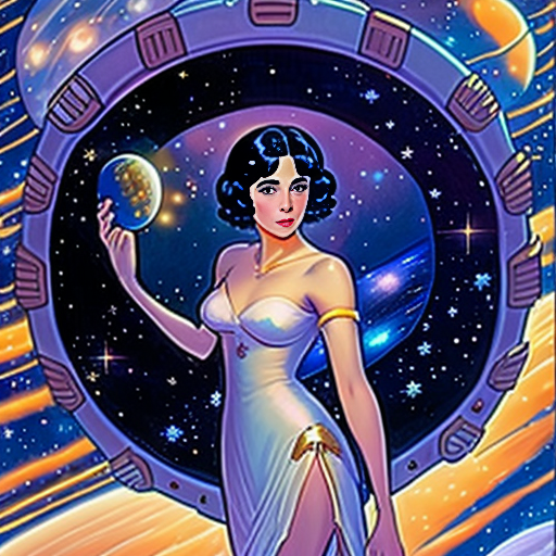
The next day, I played around with it some more, and came up with this one:
The secret sauce for this one was adding “Minerva Teichert” and “Baen Books.” Who is Minerva Teichert? She’s a famous Latter-day Saint painter from the early 20th century who paid for her son’s tuition to Brigham Young University in original paintings, many of which are still on display in the BYU Museum of Art and the Joseph Smith Memorial building.
As you can see, there are still some weird artifacts to this piece, such as the stars on the character’s jacket. That’s the tricky part with AI art: if you look at it closely, you’ll find something weirdly uncanny, like a hand with seven fingers, or a person with three arms. The steepest part of the learning curve has to do with removing these uncanny bits, either by giving better starting prompts, or by tweaking it in subsequent iterations.
I believe the prompt for this one was “a dreamy young woman with short black hair, bare shoulders, in space surrounded by stars and galaxies. Minerva Teichert and Baen Books.” The original image was a woman in a space suit, but I used something called “image to image” to create new images based on the previous one, in batches of four. I would pick what I thought was the best one for that generation, and run the program again. That’s how I eventually got to this one:
and this one:
Still need to work on the hands. Also, there’s this weird artifact, almost like poor JPEG compression, that happens if you don’t give the program enough creative leeway with each successive generation. Another method I’ve heard of is to create a really large batch based on a given image, and then use GIMP to cut and paste all the pieces that you like from each one, before running it through one final image to image pass to seamlessly combine them.
A lot of people are either really angry or really scared about AI art and what it means for the future. It’s the same with other forms of automation, I guess. Will it replace artists entirely? Will all our art be 100% AI-generated in the future? Personally, I don’t think so. These programs are just another set of tools, and require quite a bit of practice to master.
Same thing with stuff like ChatGPT and other language learning models that can be used to write poems and stories. It takes a lot of work to come up with an AI-generated story that isn’t totally boring, or has a terrible ending. It can be done, but it does require quite a bit of human input.
So I don’t see these tools replacing artists or writers, at least in the forseeable future. Rather, I think that the successful artists and writers will be the ones who incorporate these tools into their workflow, using them as force-multipliers to make some really amazing stuff. Personally, I would absolutel love it if I could use something like ChatGPT to put out a new novel every month, or even every week.
The other thing with things like novels is that most people only read them once, because they already know what’s going to happen. So if you use an AI to write a novel, but you have to feed it all the twists and plot points… what’s the point? You’ve basically already read it. This is a problem that a lot of amateur writers have with outlining: since they already know how the story is going to end, they find it difficult to sit down and write.
Now, what I could see is a prompt like “rewrite Lord of the Rings so that Sauron wins,” or “rewrite such-and-such romance novel so that this other guy ends up with the girl.” Or “make Lord of the Rings a gritty cyberpunk novel,” or… you get the picture. And honestly, I’m fine with that. If someone who enjoyed the “alpha” version wants to create a “beta” or a “gamma” version for fun, that’s cool. It might be kind of fun to see how an AI tweaks my books.
What isn’t cool is if someone takes that beta or gamma version of my novel and tries to sell it under their own name. And that’s where most of the legal stuff needs to be hammered out, over issues like copyright. I’m not going to use Stable Diffusion to remove watermarks, or to take someone else’s copyrighted art so that I can enjoy a derivative product without having to pay the artist. And when it comes to using prompts, I’m going to err on the side of using artists like Minerva Teichert who have already passed away, or large publishing houses like Baen whose style doesn’t belong to a single artist.
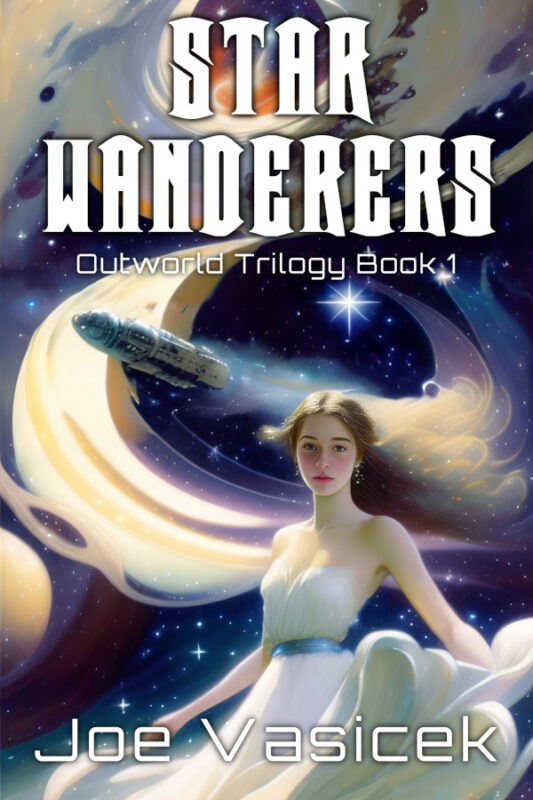
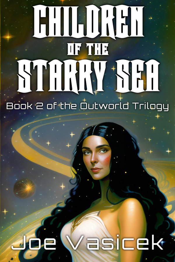
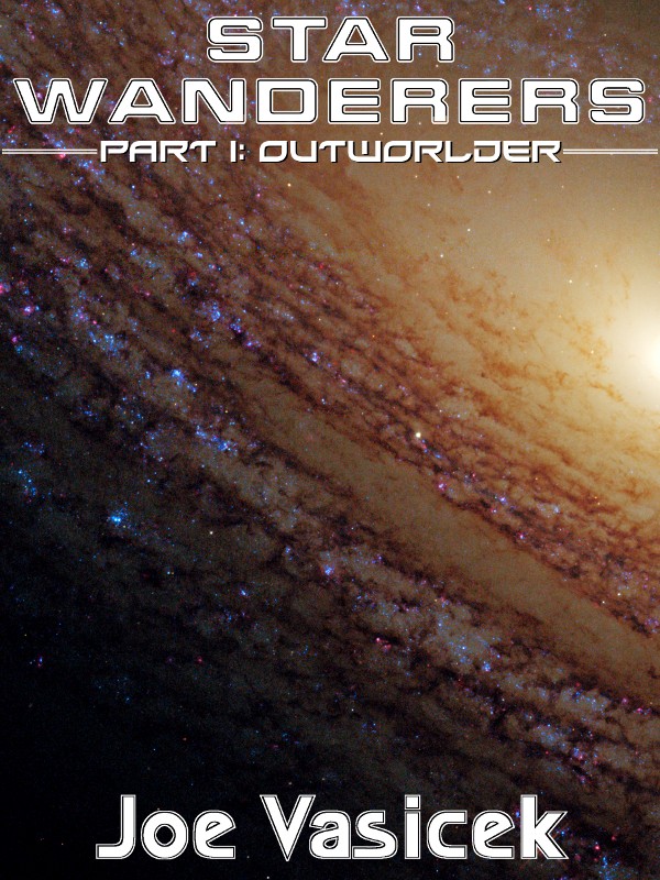
So after playing around with it some more, I finally came up with some concept art for my current novel WIP and used it to throw a cover together! What do you think? This isn’t going to be the final version—in fact, I will probably produce quite a few other test covers before I settle on the one I like. But for my current skill level (still beginner), I’m quite pleased with how it turned out!
Back a few years ago when indie publishing was a new thing, I remember there was a blog that would take the worst self-published covers and make fun of them. It was a popular site for a while, though a lot of the indies whose covers were shamed didn’t think it was all that fun.
Thing is, it’s not just self-published books that have horrible covers. In fact, some of the worst covers probably came out of traditional publishing, partially because tradpub has simply been around longer, and partially because in tradpub, cover design is often done by a committee, as opposed to just one guy. And while it’s true that some people have a unique talent for creating some truly hideous art, the IQ of a committe is the lowest common denominator of all of its members, and if one of them happens to have that talent, God bless the poor author who got stuck with that cover art.
If you go back 50-60 years, you can find some truly hideous covers, especially in science fiction. Such as:
Ah, Farnham’s Freehold. Such an awesome book—one of my all-time favorite Heinlein novels—but such a terrible, terrible cover. What is that? A giant egg with some Salvador Dali clocks, and Polynesian war chief holding court in the lobby of the hotel from The Shining? Also, why is everything a hideous tint of fuchsia? And of course, you’ve gotta have a random 60s chick in a summer dress (though to be fair, that might be one of the actual characters).
But the thing that really gets me is how dark everything is. Seriously, if you pick this book up in a used bookstore, it’s usually so faded and time-weathered that you can barely make out any of the details at all. That was certainly true of the copy that I read, back when I was working delivery for the BYU Bookstore and snatching a couple of pages here and there between drops. Good memories, seriously.
Believe it or not, this actually isn’t the worst cover of this book. I’m so glad I picked up a copy with this cover, because the cover of the Baen edition gives away the ending! It’s not even subtle about it, either! The Baen edition features the sign to the entrance of Farnham’s Freehold at the end, and it’s totally full of spoilers for the whole book. Seriously, what kind of an idiot thought that was a good idea? See my comment about the IQ of committees up above.
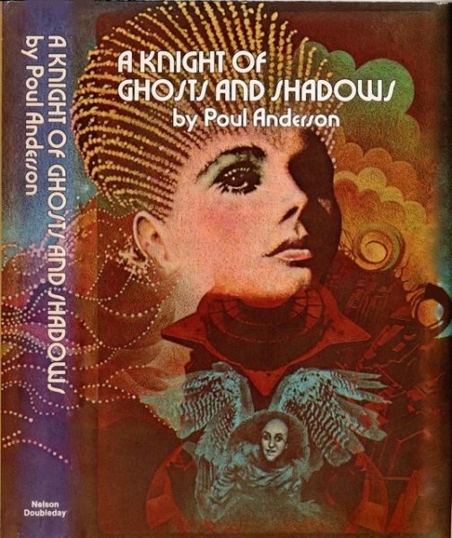
I recently picked up A Knight of Ghosts and Shadows by Poul Anderson from the library and DNFed it: too much opera, not enough space. But the cover… it takes the meaning of “hideous” to an entirely new level. In fact, this was the cover that gave me the idea of writing this blog post.
So what have we got here? There’s a psychadelic 70s chick with some hair that makes her look like Princess Leia’s grandmother, and a creepy little goblin dude in a spacesuit with random owl wings, who looks like he wants to peep on her. Also, some weird sci-fi cityscape in the background, I guess? It’s difficult to tell, because elsewhere the background looks like one of my Mom’s first-grade art projects. And of course, if that didn’t make it dated enough, you’ve got the funky 70s typography that died along with disco.
I picked up this book because 1. it was a Poul Anderson book that was at my local library, and 2. it made the Locus recommended reading list for 1975 without being nominated for the Hugo or the Nebula. Many of the other covers are surprisingly NSFW, because apparently Princess Leia’s grandmother is a futuristic sex slave—and yet, I found even the parts with her in it to be surprisingly dull. Like I said, too much opera, not enough space.
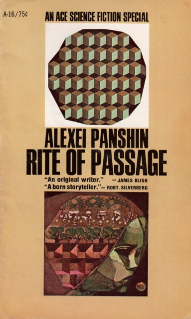
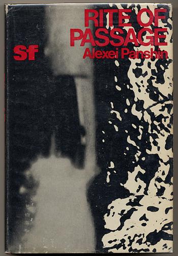
Speaking of mildly NSFW book covers that make reading in public super awkward, here is the cover of the copy of Rite of Passage by Alexei Panshin that was at the BYU Library, of all places. It’s not the cover above: I was going to post it, then thought better because it’s uncomfortably pornographic—especially when you consider that the main character is a minor. Yech. When my wife saw it, she said: “that’s a weird looking spaceship… oh wait, that’s not a spaceship!”
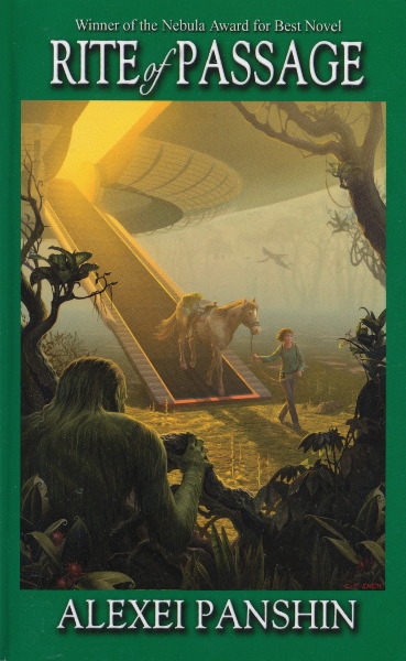
But even more hideous than that one (though perhaps not as terrible as this one), the cover above makes me think of nothing so much as the fact that communism ruins everything. Seriously, this cover has all the charm and aesthetic appeal of a Kruschev-era Soviet housing project in Eastern Ukraine, or maybe a ruined bus stop somewhere in the Kazakh steppes.
Seriously, when I lived in Georgia (the country, not the state), we would see old public art pieces from the communist era all over the place, in the soul-destroying style of socialist realism. This particular cover brings back a lot of memories of the Tbilisi subway. Which isn’t too surprising, because from reading this book, I’m pretty sure that Panshin was a socialist. In fact, it was right around this time that the entire science fiction genre swung super hard to the left, and with a few notable exceptions (David Weber, John Ringo, Larry Correia), it’s never really swung back.
…and looking at Alexei Panshin’s Wikipedia entry, it appears that he passed away less than a month ago. RIP. Fortunately, he got at least one good cover for Rite of Passage before he died.
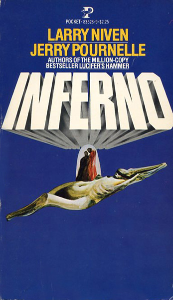
My wife recently read Inferno by Larry Niven and Jerry Pournelle, and she really enjoyed it. Based on her recommendation, I picked up a copy (not this one, thank goodness!) and I’m reading it now. It’s pretty good, but what the heck is going on with this cover? Seriously, it’s like someone puked up a mummy on the blue screen of death from Windows XP, except without any text. And what’s with the two monks standing on the mummy’s belly? Like, who saw the preliminary sketches of this cover art and thought “yup, that’s going to attract the right kind of reader and sell a bunch of books.” Thankfully, the book sold reall well in spite of this cover, not because of it.
So much for retro cover fails. What are some of your personal favorites that still stand out after all these years?
This author’s note originally appeared in the September 26th edition of my author newsletter. To subscribe to my newsletter, click here.
So for this newsletter’s author’s note, I thought I’d do a roundup of all the magazines that have published my short stories in the last six months. There’s a surprisingly large number of them. They’re all great publications, so if any of them look interesting, feel free to give them your support and pick up a copy or two.
(As a side note, I’ve found that some email clients break my hyperlinks if I have too many of them in one email. I’m going to put the links in anyway, but if they’re broken for you, please let me know.)
First, my story “The Janus Anomaly” appeared in Kasma Magazine in May. It’s still up on the website, if you want to read it. They did a great illustration for it too!
The story is about a science officer on a scout ship that encounters an alien anomaly, and she can’t tell if she’s losing her mind or if she’s the only sane one while everyone else is crazy. Also, the story takes place in the same universe as the Gunslinger Trilogy.
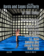
Second, my story “The Gettysburg Paradox” appeared in the July issue of Bards and Sages Quarterly. The ebook copy of the magazine is available on most ebookstores, and you can find the link here.
The story is about a time traveling tourist at the Battle of Gettysburg who learns that almost all of the combatants are (not so secretly) time travelers themselves. In their efforts to reshape the world, they’ve all converged on this one turning point in history, making it the largest battle ever fought on American soil.
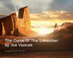
Third, my story “The Curse of the Lifewalker” appeared on The New Accelerator just last month. This is my third story that the good folks at TNA have picked up, and they publish new stories weekly with a very reasonable subscription model to their site.
The story takes place in Utah Valley a couple of hundred years after the apocalypse. Humanity has been afflicted with a blight that shortens all of our lifespans to 25 years, but the main character is one of the few people who is immune. But because of how things have changed in the intervening centuries, his immunity turns out to be more of a curse than a blessing, as he gradually becomes an outsider in his own community.
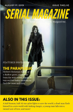
Fourth, my story “Lizzie-99XT” appeared in last month’s issue of Serial Magazine. The digital copy of the magazine is $2.99, and the print copy is $4.99. There are a bunch of other stories in this issue, and all of them are about life and death decisions.
Next month, I have a couple more stories coming out. “Starchild” will appear as a reprint in Bards and Sages Quarterly, and “The Infiltrator,” a never before published story, will appear in the anthology Not Far From Roswell. So be sure to keep an eye out for those!
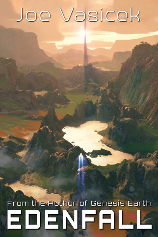
Finally, here is the cover art for Edenfall. Check it out!
I’m very happy with how it turned out. The illustration is by Hideyoshi, aka Lorenz Ruwwe, who did the cover art for Genesis Earth. I still have to go through the edits, but that shouldn’t take longer than a week, and the ebook will be up for preorder shortly after. The release date will be in December.
Last week in my author newsletter, I revealed the cover art for my next big novel release, Edenfall. This is the sequel to Genesis Earth and the second book in that trilogy.
Without any further ado, here is the cover!
The art is by Lorenz Ruwwe, aka Hideyoshi. I’m really happy with how it turned out. He did the art for Genesis Earth, so I’m really glad I was able to get him for this one too.
Edenfall will be up for preorder soon. To keep up with all of my new releases, as well as writing updates, special offers, book recommendations, and other cool stuff, be sure to sign up for my author newsletter! I’ve scaled back my blogging, so that’s the best way to keep up with me now.
From what I’ve managed to gather (and I could be totally wrong), the controversy in the indie writing community over MVP began when the guy who started 20 Books to 50K first started a topic on KBoards, talking about how he’d used the MVP concept to launch a successful career. This rubbed the KBoards groupthink in the wrong way, and they ran him out with torches and pitchforks, so he started his own group. Indie writers have been arguing about it ever since.
On the one hand, I can’t really criticize the concept, because I kind of followed it myself. When I published my first three books, I sunk a fair amount of money into them, and when I realized it was going to take a long time to earn that back I shifted strategy, publishing the best quality work that I could on a shoestring budget. The result was this:
Ah, the good old days when I was young and stupid (now I’m just stupid). Cover art taken from NASA, which is all in the public domain. Title and subtitle font taken from a free font site, author font cribbed from an old 90s-era Sid Meier’s Alpha Centauri CD-ROM. No gradients or visual effects on the text itself—even the drop shadow is just a mirror image of the text in black, offset diagonally by a few pixels. As if that’s not enough, the aspect ratio is 3:4, which makes me want to grate my teeth.
So that was my minimum viable product at the time. The other novellas had very similar covers, with NASA space art, free fonts, and everything else. I also self-edited most of them, though I did have some editing student friends who volunteered to proofread the later ones. Surprisingly, the books sold. By 2013, they’d earned enough that I could afford to hire out a cover designer, who made the covers the books have today. Needless to say, the quality is much better.
I guess you could say the MVP strategy worked for me, though I’m not so sure it would work as well today. The key point, though, is that once I could afford to upgrade to a better quality product, I did so. The production aspect of a book is stuff like the cover art, copy editing, proofreading, etc. Most of that stuff can be upgraded over time, so if you have to do it on a shoestring budget, it’s not such a big deal.
But in my opinion, the writing itself is completely different. Some writers will go back and rewrite their books after they’re published, but I think that’s a horrible idea. What about the readers who enjoyed the first version? It’s okay to fix things like typos, or maybe remove some bad language but changing things so completely that the story itself changes is just wrong. It’s how we end up with memes like this:
A lot of people got pissed at George Lucas for the changes he made to the original Star Wars trilogy, myself included. It’s one thing to update the CGI for the X-wing dogfights, but it’s something else entirely to rewrite the characters. Han shot first, dammit!
So as far as MVP goes, I don’t think it works for writing—at least, not the kind of books that I’m trying to write. Perhaps in some genres, like porn, clickbait, and Buzzfeed articles, it’s better to put as little time and energy into the writing as you can get away with, but for the books I like to read, I want to know that the author did their best work. You can’t produce your best work and simultaneously aim for what’s minimally viable.
Of course, as the Draft2Digital blog post points out, that doesn’t mean that you should write slowly and slog through endless revisions. Sometimes the best books are written quickly, in a single draft. One of the great enduring myths is that there’s a correlation between how good a book is and how long it takes to write it, and another enduring myth is that revisions always make a book better.
I know there are some indies out there who have had great success by reading the one-star reviews and rewriting their books accordingly. To which I say: you shouldn’t use paying customers as beta testers like that.
Some media formats, like blogs, TV, or magazines, are designed to be ephemeral or to be changed or updated over time. Books are not. As Stephen King put it in On Writing, when we write a book, we are acting as time travelers, packaging up our stories and sending them forth, to be recreated in the mind of a reader long after we have written it. Books are unique like that.
So that’s what I think about minimum viable product. It’s a useful way of thinking about all the stuff you can update later, but for the story itself, it’s a horrible idea. Write the best book you can right now, then send it out into the world and write another one. That’s my strategy, at least.
For the last couple of months, all of my paperbacks have been unavailable due to some quality control problems with KDP Paperback. The quality of their product is substantially inferior to CreateSpace, unfortunately. But for now, it still remains the best option for getting my books out in paperback, so that’s what I’m doing until I can put them up through Ingram Spark.
To mitigate the quality problems, I’ve made a new cover design which I hope to replicate across all of my paperback books. The biggest problem was that the cover was misaligned beyond the margin of error in the cover template, meaning that the front cover would bleed into the spine, or vice versa. As you can see, the new design has a solid background that wraps around the whole cover, with the text and art well outside of the margin of error. If Amazon screws this up, you’d be justified in asking customer service for another copy, or a refund.
In any case, I’m going to roll out the new paperbacks gradually over the next few months, as I manage to get to them. The inside content is changing slightly, in that I’m including the author’s notes at the end. I’m also adding chapter names to my earlier books, where previously they were simply “Chapter One” or “Chapter Two.” Other than that, everything is mostly the same.
I like the way the design for this one turned out. The paperback cover itself is slightly darker than the image shown, but all I’ve got right now is the proof, so I’ll post images after I’ve ordered a few author copies to sell. Hopefully by the end of this year, all of my books novella length and longer will be up in print as well as ebook!
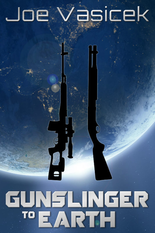
I’m finishing up right now with the third and final book in the Gunslingers Trilogy, Gunslinger to Earth. Just one more chapter to wrap everything up, then all the final revisions for the last few chapters. So far, so good.
At 40k words, this is turning out to be one of my shorter novels. I’m really happy with how it’s turned out so far, though. It wraps up a bunch of stuff from the previous books, with a surprisingly hopeful and optimistic look toward the future of the universe.
Over the next couple of weeks, I’ll post a few excerpts, being careful to avoid any spoilers for the previous books. If all goes well, it should be up for preorder sometime in February, with an April release date.
In case you’re curious, I wrote almost the whole thing while listening to the 2009 A State of Trance year mix. Such a great year for trance.
I’m going to try to put out my book covers and descriptions before the books are actually written. That way, I have an image I can use whenever I’m blogging about it. Also should help with promotions.
Gunslinger to the Galaxy is coming along well. Should finish up with the first draft sometime in September. This book is a really fun one! It picks up right where Gunslinger to the Stars drops off and doesn’t stop for anything. If you thought the explosions in the first book were big, wait for the second one!
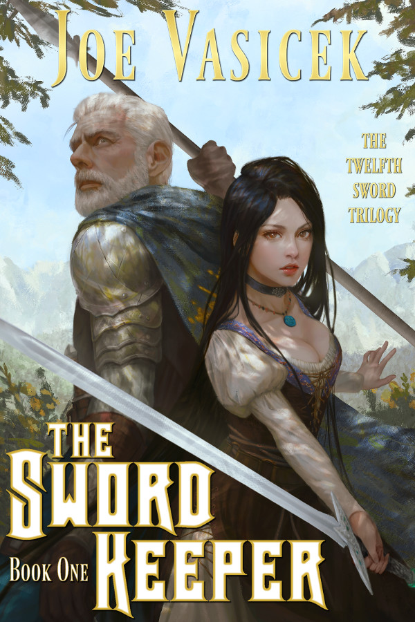
In other news, I should have a cover for The Sword Keeper soon. The art looks fantastic! Really happy with how it’s turning out. I’m almost through all the edits, too, so it shouldn’t be long before that ones up for preorder. Hopefully by the end of the week.


 Shout out to
 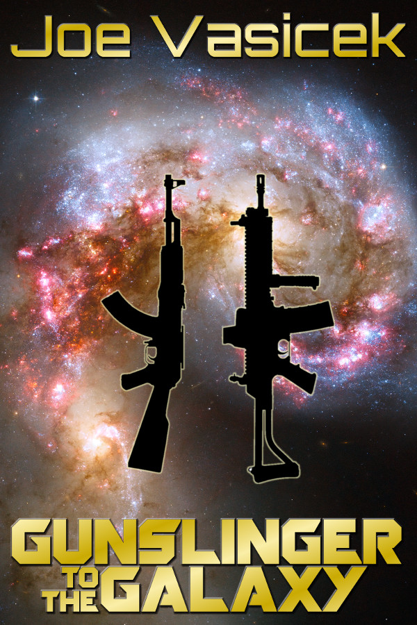 Just playing around. What do you guys think?
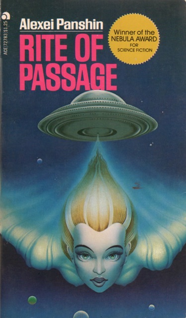