Back a few years ago when indie publishing was a new thing, I remember there was a blog that would take the worst self-published covers and make fun of them. It was a popular site for a while, though a lot of the indies whose covers were shamed didn’t think it was all that fun.
Thing is, it’s not just self-published books that have horrible covers. In fact, some of the worst covers probably came out of traditional publishing, partially because tradpub has simply been around longer, and partially because in tradpub, cover design is often done by a committee, as opposed to just one guy. And while it’s true that some people have a unique talent for creating some truly hideous art, the IQ of a committe is the lowest common denominator of all of its members, and if one of them happens to have that talent, God bless the poor author who got stuck with that cover art.
If you go back 50-60 years, you can find some truly hideous covers, especially in science fiction. Such as:

Ah, Farnham’s Freehold. Such an awesome book—one of my all-time favorite Heinlein novels—but such a terrible, terrible cover. What is that? A giant egg with some Salvador Dali clocks, and Polynesian war chief holding court in the lobby of the hotel from The Shining? Also, why is everything a hideous tint of fuchsia? And of course, you’ve gotta have a random 60s chick in a summer dress (though to be fair, that might be one of the actual characters).
But the thing that really gets me is how dark everything is. Seriously, if you pick this book up in a used bookstore, it’s usually so faded and time-weathered that you can barely make out any of the details at all. That was certainly true of the copy that I read, back when I was working delivery for the BYU Bookstore and snatching a couple of pages here and there between drops. Good memories, seriously.
Believe it or not, this actually isn’t the worst cover of this book. I’m so glad I picked up a copy with this cover, because the cover of the Baen edition gives away the ending! It’s not even subtle about it, either! The Baen edition features the sign to the entrance of Farnham’s Freehold at the end, and it’s totally full of spoilers for the whole book. Seriously, what kind of an idiot thought that was a good idea? See my comment about the IQ of committees up above.

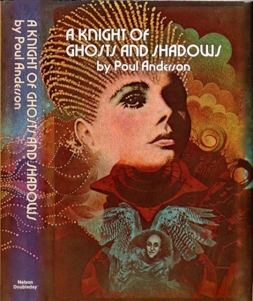
I recently picked up A Knight of Ghosts and Shadows by Poul Anderson from the library and DNFed it: too much opera, not enough space. But the cover… it takes the meaning of “hideous” to an entirely new level. In fact, this was the cover that gave me the idea of writing this blog post.
So what have we got here? There’s a psychadelic 70s chick with some hair that makes her look like Princess Leia’s grandmother, and a creepy little goblin dude in a spacesuit with random owl wings, who looks like he wants to peep on her. Also, some weird sci-fi cityscape in the background, I guess? It’s difficult to tell, because elsewhere the background looks like one of my Mom’s first-grade art projects. And of course, if that didn’t make it dated enough, you’ve got the funky 70s typography that died along with disco.
I picked up this book because 1. it was a Poul Anderson book that was at my local library, and 2. it made the Locus recommended reading list for 1975 without being nominated for the Hugo or the Nebula. Many of the other covers are surprisingly NSFW, because apparently Princess Leia’s grandmother is a futuristic sex slave—and yet, I found even the parts with her in it to be surprisingly dull. Like I said, too much opera, not enough space.

Speaking of mildly NSFW book covers that make reading in public super awkward, here is the cover of the copy of Rite of Passage by Alexei Panshin that was at the BYU Library, of all places. It’s not the cover above: I was going to post it, then thought better because it’s uncomfortably pornographic—especially when you consider that the main character is a minor. Yech. When my wife saw it, she said: “that’s a weird looking spaceship… oh wait, that’s not a spaceship!”
But even more hideous than that one (though perhaps not as terrible as this one), the cover above makes me think of nothing so much as the fact that communism ruins everything. Seriously, this cover has all the charm and aesthetic appeal of a Kruschev-era Soviet housing project in Eastern Ukraine, or maybe a ruined bus stop somewhere in the Kazakh steppes.
Seriously, when I lived in Georgia (the country, not the state), we would see old public art pieces from the communist era all over the place, in the soul-destroying style of socialist realism. This particular cover brings back a lot of memories of the Tbilisi subway. Which isn’t too surprising, because from reading this book, I’m pretty sure that Panshin was a socialist. In fact, it was right around this time that the entire science fiction genre swung super hard to the left, and with a few notable exceptions (David Weber, John Ringo, Larry Correia), it’s never really swung back.
…and looking at Alexei Panshin’s Wikipedia entry, it appears that he passed away less than a month ago. RIP. Fortunately, he got at least one good cover for Rite of Passage before he died.

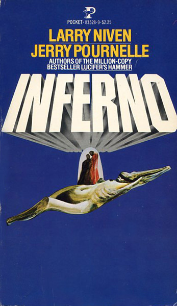
My wife recently read Inferno by Larry Niven and Jerry Pournelle, and she really enjoyed it. Based on her recommendation, I picked up a copy (not this one, thank goodness!) and I’m reading it now. It’s pretty good, but what the heck is going on with this cover? Seriously, it’s like someone puked up a mummy on the blue screen of death from Windows XP, except without any text. And what’s with the two monks standing on the mummy’s belly? Like, who saw the preliminary sketches of this cover art and thought “yup, that’s going to attract the right kind of reader and sell a bunch of books.” Thankfully, the book sold reall well in spite of this cover, not because of it.
So much for retro cover fails. What are some of your personal favorites that still stand out after all these years?
Not really hard sci-fi, but the covers for C.S. Lewis’s Space trilogy, Macmillan, 1965, are so bad I feel sorry for Lewis. They convey nothing of the story, and they’re ugly to boot. The first one is either split pea soup or puke-colored, depending on how charitable you want to be, with a round landing craft and a tiny space-suited figure, and it just gets worse from there.
On the flip side, I first read A Swiftly Tilting Planet by Madeleine L’Engle mainly because of the cover on the old copy my mom had – a pegasus leaping through clouds with monsters reaching for it. I had no context for the story, not having read A Wrinkle in Time, but I loved that cover so much that I went to the trouble of copying it (badly) with tracing paper, because the book itself started to disintegrate after I read it for the umpteenth time.